.svg)
The best system fonts and alternatives to Arial for PowerPoint
Discover our best system fonts for your PowerPoint presentations
Author
Jérôme Bestel
Updated on
March 18, 2025
Created on
January 28, 2025
Category
Art Direction


Many system fonts have disappointing renderings or are poorly adapted to the professional world, or even to screens or printing. Their availability has made them too popular and overused. We guide you in the wide choice of fonts offered by default to keep original and professional renderings for your presentations.
What is a system font?
A system font is a font pre-installed on your operating system, which means that you can natively read a document that used this font without having to install it or ask to install it on PowerPoint for example.
Why use a system font for your PowerPoint presentations?
There are several situations that push us to use system fonts for our PowerPoint presentations:
- Want to share a presentation without having to ask for fonts to be installed
- Fonts chosen by the company or brand cannot be incorporated into the presentation
- Users are on Mac and PC and it is necessary to find a font common to both systems.
- You want to deploy a PowerPoint template to a large number of users
- Simply for simplicity and to have a lightweight presentation that is compatible with as many people as possible.
Despite a wide range of fonts installed by default on operating systems, it can be difficult to choose the right font. The design evolves, the needs with and unfortunately the system fonts change very little over time.
Worse, the default font proposed by the tool (Calibri) is only poorly adapted to the professional world and has rarely had the approval of the design community, nor that of our presentation design agency
Finally, Arial, designed as a copy of Helvetica (the latter being much better done), conveys an impression of neutrality and deja vu that can in no way highlight your brand or your project.
Discover our selection of the best system fonts to use for your presentations, based on these selection criteria:
- Police rendering in a professional context
- Accessibility and a good level of reading
- The balance of typography and our personal taste
- A good result on the screens rather than on the print
Our best system fonts for your PowerPoint presentations

Segoe UI is a font designed by Microsoft, it is mainly used for Windows operating systems and Office applications. It is considered to be a modern and elegant font that is ideal for titles and subtitles.
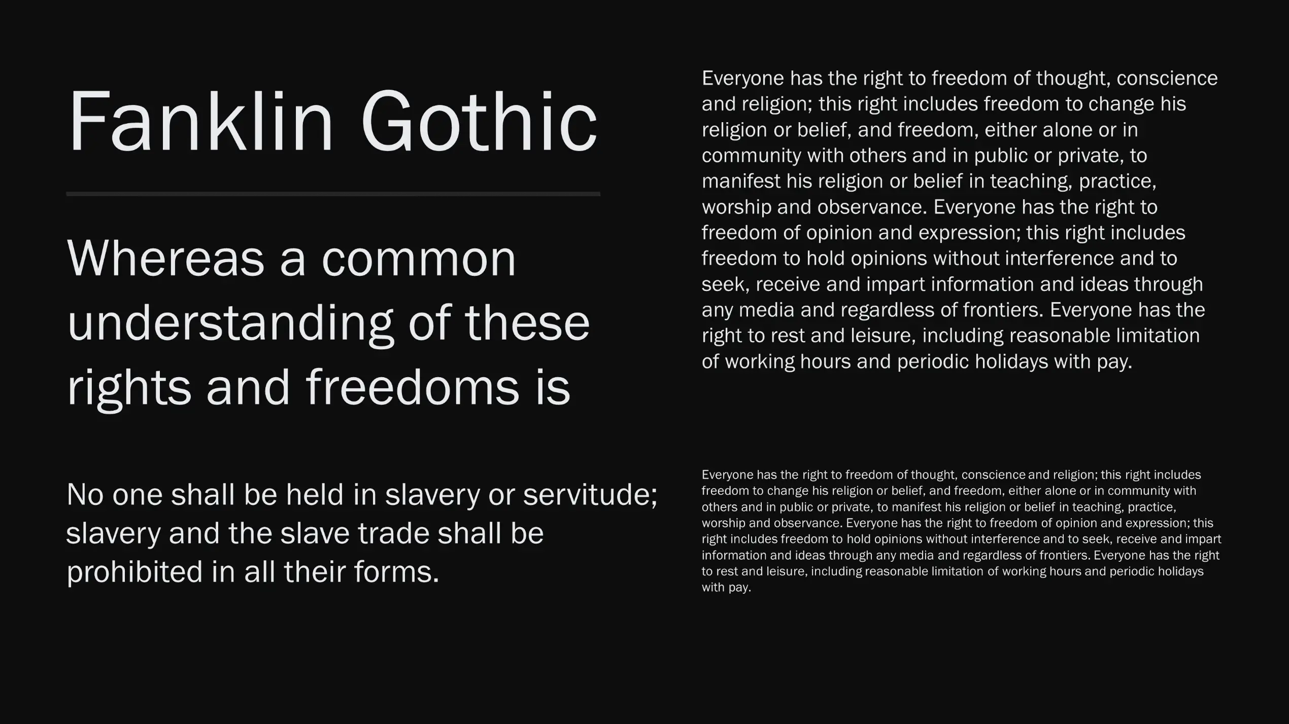
Franklin Gothic is a classic typeface created in 1902 by Morris Fuller Benton. It is often used for titles and headers because it is very legible and clear. It is also used in press publications and advertising posters.

Century Gothic is a modern typeface created in 1991 by Monotype Imaging. It is often used for titles and subtitles because it is elegant and easy to read. It is also used in graphic designs and websites.

Book Antiqua is a classic typeface inspired by the typefaces used for books printed by hand in the Middle Ages. It is often used for the titles and subheadings of important documents, such as books, reports, and theses.

Century School is a typeface created in 1894 by Morris Fuller Benton. It is often used for the titles and subtitles of important documents such as books, reports, and theses. It is also used for graphic designs and websites.

Bell MT is a classic typeface created in 1917 by John Howard Benson. It is often used for the titles and subheadings of important documents such as books, reports, and theses. It is also used for graphic designs and websites.
These fonts are available on Windows, if you are on Mac we recommend that you opt for Helvetica. If you are looking for a font common to Mac and Windows, the choice is limited and we recommend Verdana, or even Arial, which remains the only choice available for your presentation.
Fonts we don't recommend for presentations
- Calibri: Calibri is very commonly used in Microsoft Office documents and may therefore be considered too common for certain professional uses.
- Tahoma: Tahoma is similar to Arial in terms of style; it may be considered too common for some professional uses.
- Trebuchet MS: Trebuchet MS is similar to Arial in terms of style; it may be considered too common for some professional uses.
- Cambria: Cambria is similar to Calibri in terms of style; it may be considered too common for some professional uses.
- Arial: Arial is considered to be a “generic” font and may be considered too common for some professional uses. It is often used for basic documents and PowerPoint presentations, which can make it less effective for important documents or graphic designs.
- Comic Sans: Comic Sans is considered to be unprofessional and unreliable. It is often combined with materials created for children or humorous presentations, which may make it unsuitable for professional documents or serious graphic designs.
It is important to note that selecting the appropriate font depends on the intended use and the target audience. It is recommended that you choose a legible and professional font that suits the content of your document and is close to your visual identity. It will always be more beneficial to go to premium fonts and use those provided by your brand rather than adopting pre-installed fonts.
What is the difference between a system font and an installed font?
You may be wondering what is the difference between a system font and an installed font? Both are options when it comes to choosing a font for your PowerPoint presentations. The main difference between a system font and an installed font is that the former comes with your operating system and is available only on that operating system, while the latter can be installed on multiple operating systems. System fonts are generally the best suited for your PowerPoint presentations and their advantage is that all users can see and use them.
In summary:
A system font comes with your operating system and is available only on that operating system, while an installed font can be installed on multiple operating systems. System fonts are generally the most practical for your PowerPoint presentations, but the least aesthetic.
If you are looking to install custom fonts, find our article on How to install a font on PowerPoint.