.svg)
15 illustrated rules to improve the design of your PowerPoint presentations
Discover 15 simple rules to improve the rendering of your slides. From Slidor's creative director.
Author
Jérôme Bestel
Updated on
March 18, 2025
Created on
January 28, 2025
Category
Art Direction


Information design is above all a question of best practices. Then taste and creativity. Let's focus on the first point, you will quickly realize that the quality of rendering of your presentations is directly linked to a set of rules that will fulfill 70% of the graphic work. It's gone.
Managing your texts is essential
The majority of your slide is composed of text and that is the first thing to act on. We often think that adding graphic elements to your slide will improve the rendering when most of the work is done on the existing one. Often, acting only on the hierarchy of content, font and space are enough to create a visual slide.
Do you find a successful user interface? This is mainly because the texts are well managed and the font chosen works.
Pick a nice font, forget Calibri
By default, PowerPoint requires Calibri. Not that the font is poorly designed, it is part of the Humanists family with a rendering that is often too classical or traditional. Other choices will make your presentation more visual. You wouldn't choose Calibri for your website, neither would I. We never used it in our PowerPoint Agency.

If you need to use a system font
Segoe UI is ideal on Windows, it's the one for your operating system. Hyper-readable in all sizes and available in several fat levels (bold, semi-bold, etc.).
Helvetica on Mac, or Avenir or even San Francisco.
If you need a system font that is common to both operating systems, choose Arial: one of the only choices you have left in the Sans-Serif family.
If you want a free font
Google fonts will offer you numerous choices adopted by millions of sites: Open Sans, Roboto, Raleway, Montserrat, Lato and all the others. Choices that are going very well and will already significantly raise the level of your slides.
Inter, created in 2016 and recently published on Google Fonts, is one of the free fonts that I love but already very widely adopted. Poppins is also one of my favorites.


If you're on a budget: premium policies
If you want to stand out and go to a higher level of quality, premium fonts exist because they are often better.
And as the saying goes so well practicaltypography.com :
Please don't adopt the slogan “A Design Firm Unlike Any Other” and then set it in Helvetica.
My personal choices are: Circular (Spotify), Graphik, Eina Sans, Aktiv Grotesk, Quarto, Maison. Many other choices are available at these famous foundries: Monotype (authors of the recent Futura Now and Helvetica Now), Grotesque environment, Klim or Lineto.


One font or two?
One font is enough and it is the choice of the majority of major brands to maintain a recognizable visual identity.
If you want to use two, the rule is simple: use fonts from different families (Serif + Sans-Serif for example). Using two fonts that look the same is rarely a good idea, so avoid Arial + Segoe UI.


How do I embed a font in my PowerPoint?
If you export your presentation to PDF, you can use any font and send your presentation that will always look the right way.
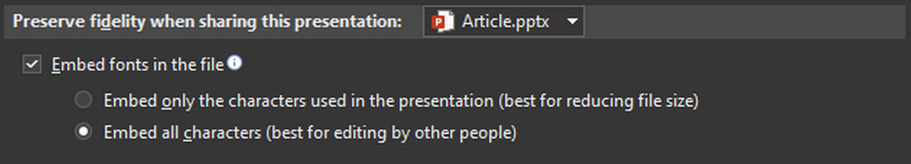
If you want to incorporate a font into your presentation, you can do so in the recording options, but your font must have embedding rights in order for this to be feasible. All Google Fonts fonts are. Not paid licensed fonts.
Any computer on Windows will thus be able to open the presentation and read it with the right fonts if the user has administrative rights on his computer. On Mac, you will usually have to install them first, although recent Mac versions take font integration into account. Version 16.17 (September 24, 2018) brings this function, the most recent to date being 16.39.
My advice: send your presentations in PDF externally, never in PPTX. Internally, ask IT to pre-install your fonts on all computers or install them yourself if you have administrator rights.
Text management
Line spacing (leading)
You will never be able to get visual slides if you don't fix this point. The default line spacing on PowerPoint is too low, consider increasing it (1.2 or 1.3) on your body text (8-16px). Conversely, reduce the value on large texts (>20px: it often happens that you have to set it to 0.9 or 0.8). In reality, the leading also depends on the length and width of your paragraph, or on the background color of your slide, but simply increasing it on the body of text will already give a significant improvement.
Large text size = less leading. Small text size = more leading.
The alignments
Aligning all of your text to the left ensures that you don't make any mistakes. You can center your texts if you want to get symmetry in a slide, and on short texts. Never justify on a presentation.


Mixing alignments (centered then aligned to the left) within the same slide is rarely a good idea, unless your elements are already part of a box that encapsulates them.
The visual hierarchy
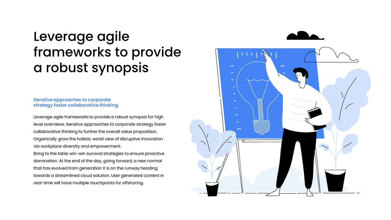
The Web abuses them just like advertising posters, and our slides can often use this principle: a large font size for titles or strong messages, and a reasonable body of text for a sentence explaining the product or service. In short: avoid putting a font size that is too similar to two distinct hierarchy elements and make a difference. Your title invites you to read and should be relatively important.

The space
Negative space (or white space) is what makes it possible to give importance to each of your elements.
“Make the logo bigger, make the texts bigger, enlarge the pictograms” are all guidelines that will take away elegance and clarity from your design. Space is a part of your design and you need to think of it as a graphic element that you can't take away. The most common design mistake is wanting to fill it out.
You will find space in everything around you to give importance: art galleries and paintings on display, call to actions on websites, or even the Google homepage. In practice, each element should have a sufficient margin of space.
The business practice is often to paste our title at the top left to leave space for our content and this is already a mistake that costs your design a lot. Put your titles inside your slide, and let your elements breathe. This will create an invisible frame for your design. Have you ever seen a title that touches the top left corner of your screen on a website? Me neither. Same principle for our slides.
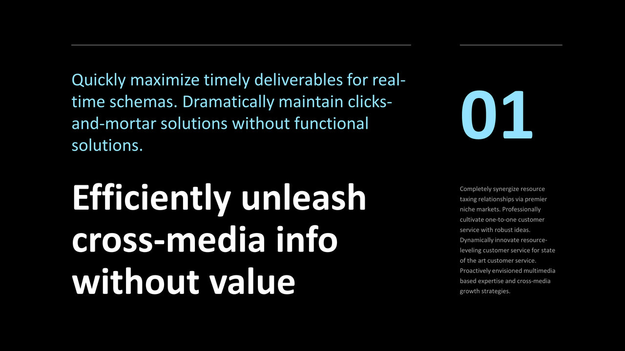
Example of improving a slide by playing on space:
The space inside your boxes
If you create boxes to contain your items, again leave these large margins to highlight the content that is there.
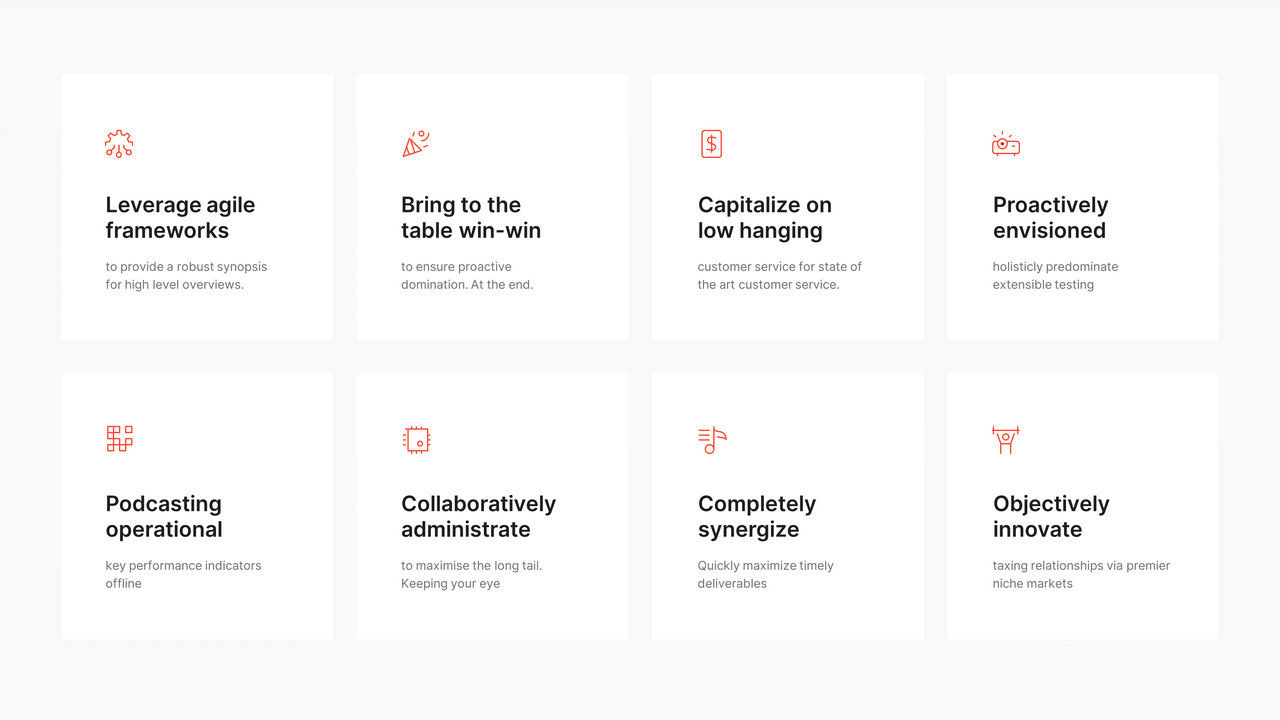
The same principle applies to icons, leave large margins and opt for a reasonable size.

Composition is king
Your slides don't have to be all the same
You've already heard this feedback and shouldn't be following it:
“The titles should all be in the same place and in size 18"
“You have to repeat the logo all the time in this place”
“The template must be respected on all slides.”
A presentation, like all visual media (web, magazine, advertising) should not be a recurring series of the same design. Set the pace, change the compositions and organize your content to highlight it and make you want to continue reading.

Beyond the graphic charter, we speak of a “Design System”, a series of rules that allows you to express yourself while respecting a framework in any medium and need, but which would never require the placement of a title always in the same place on a medium.
We thus forget the “best practices” of consulting firms, which are often constrained, and we prefer a presentation that offers diversity as long as you stay in your graphic universe, or your Design System. A professional presentation does not necessarily involve a restrictive framework, regardless of the subject being addressed. The composition must be found everywhere: from the most serious documents to event keynotes.
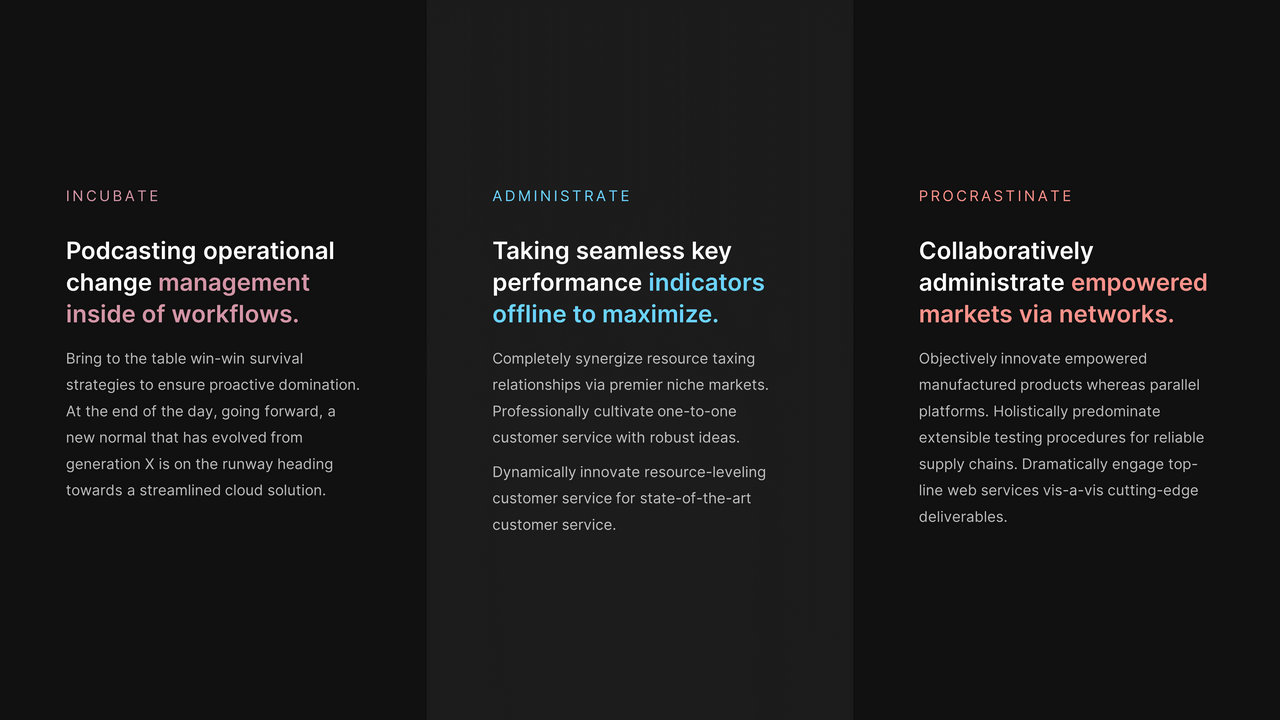
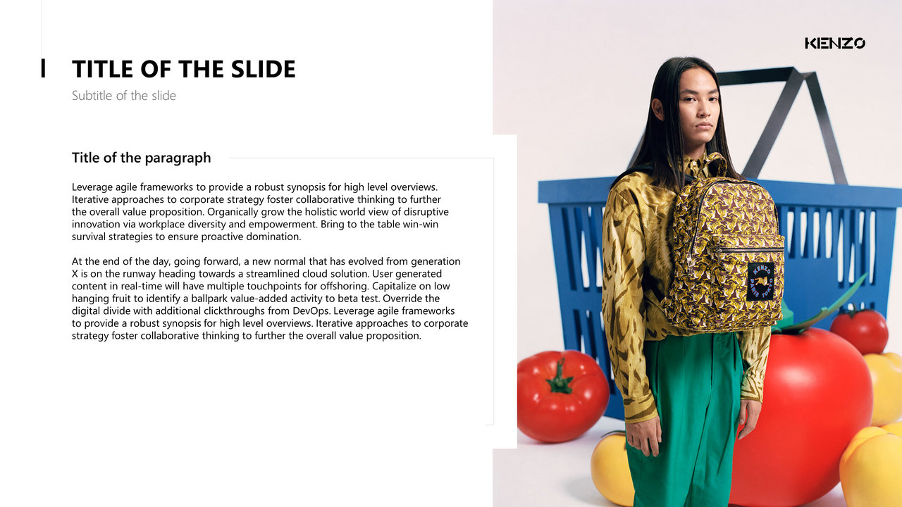
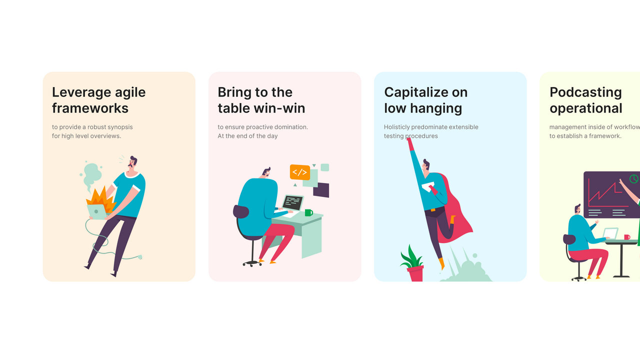
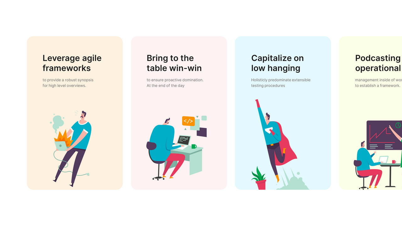
Standard composition (title at the top left, content in two columns)
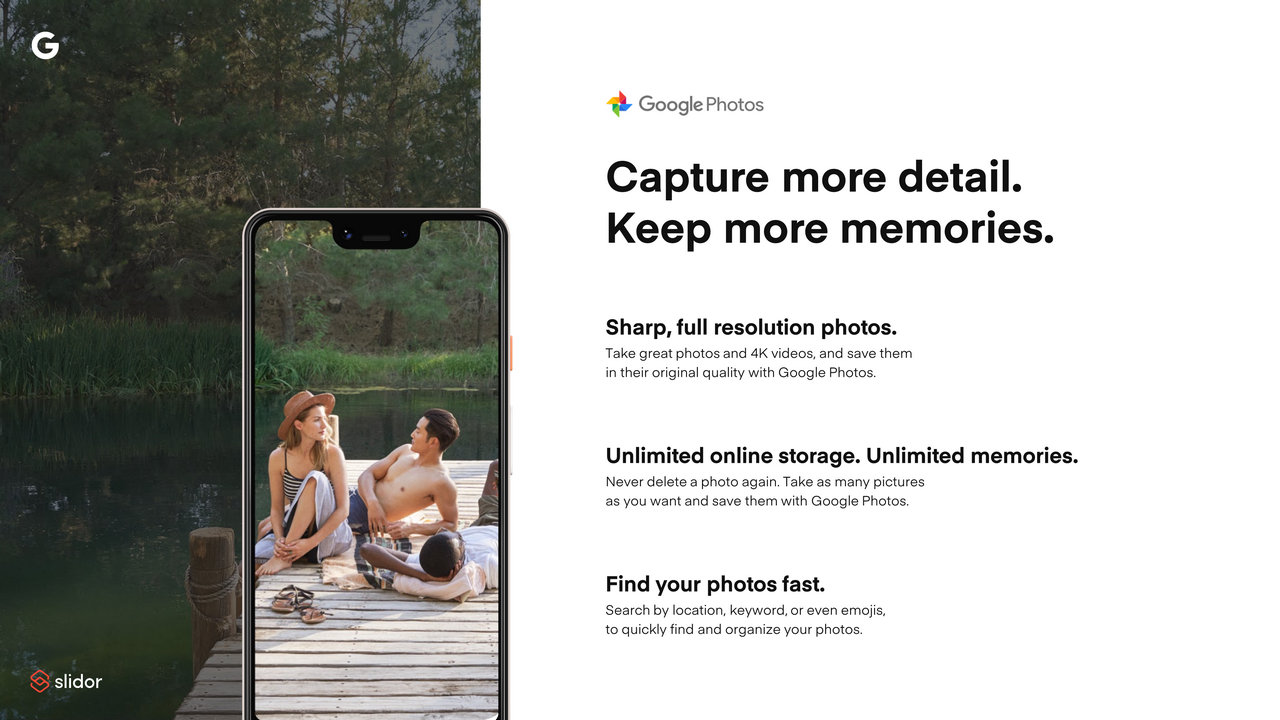
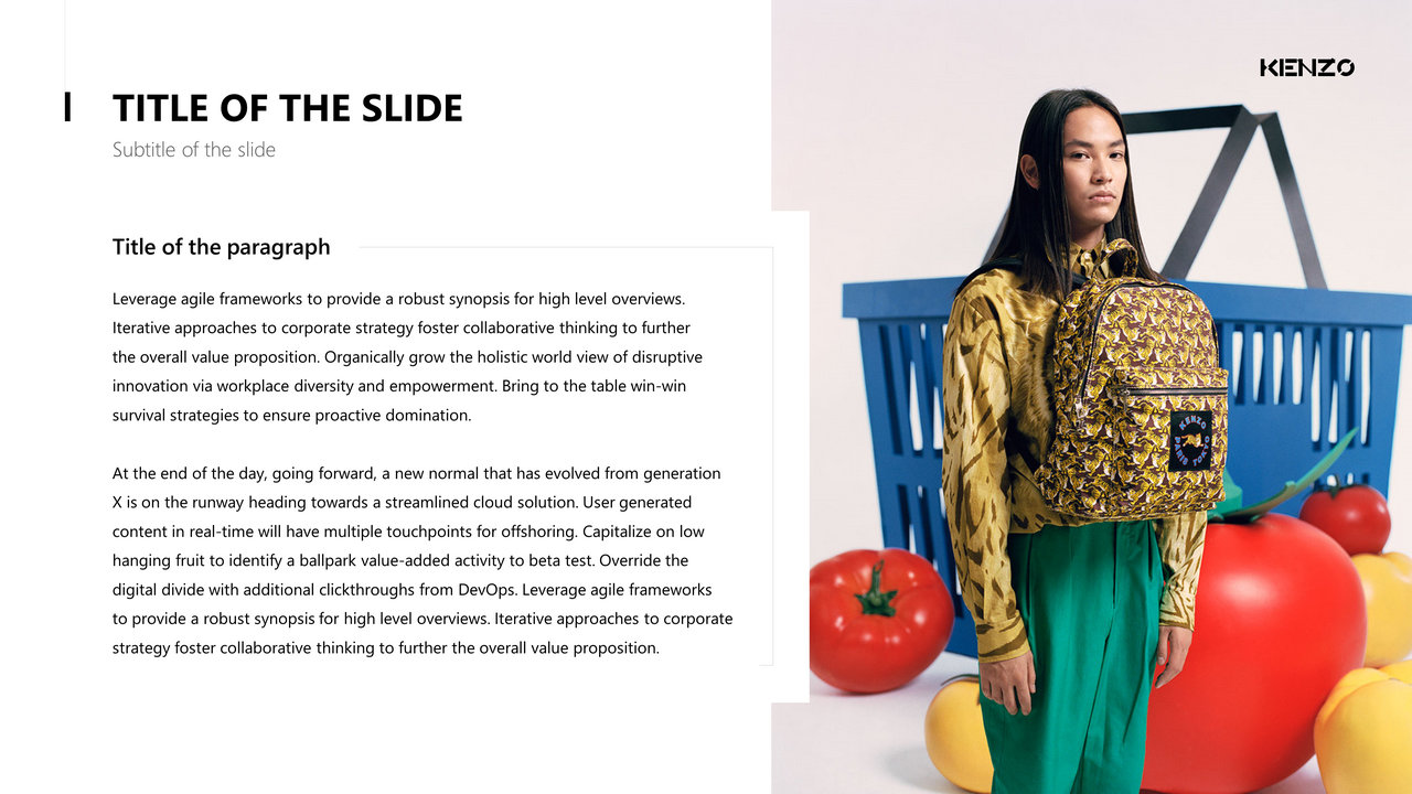
Same slide with a composition optimized for the content
Do you want to add 3 paragraphs to the last example? Change the composition again
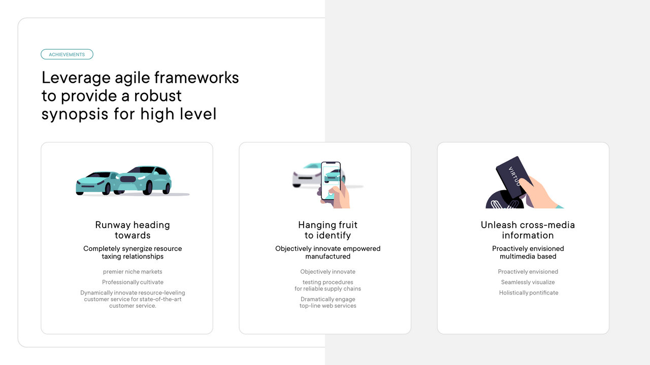
Other original composition examples

The columnar design
Think Web and realize that no text content takes up the full width of the screen (Ok, except the poor Wikipedia student).
It's the same principle for slides that require using at least two columns or limiting the width of your content. This is to avoid scanning the entire width of the screen when reading and to keep paragraph sizes reasonable, especially on 16/9th.


Do you do without bullet points
PowerPoint is by far the number 1 ambassador on the bulleted list. You can almost always get by without and keep visual slides, thanks to the space and hierarchy of your texts. Avoid starting your paragraphs with bullet points as well, even though this is the default option in PowerPoint.

If you encapsulate your elements, do it subtly


Divide your content when presenting orally
Companies will often ask you for a number of slides for a presentation rather than express it in time. “10 slides maximum”. While the presentation lasts 20 minutes. This gives us 2 minutes per slide, which is the time it takes for an adult to do 70 squats. This is way too much and it often requires you to fill in 2 minutes of content on a single slide.
Start with slides that last about 30 seconds, and allow yourself differences depending on the point addressed. In fact, the number of slides in your presentation does not increase its length. And simply clicking to go to the next piece of information will remind your audience to not only see what's happening on the screen, but also to set the pace. On top of that, you'll have more space and more creative possibilities for your content. Take advantage of it.
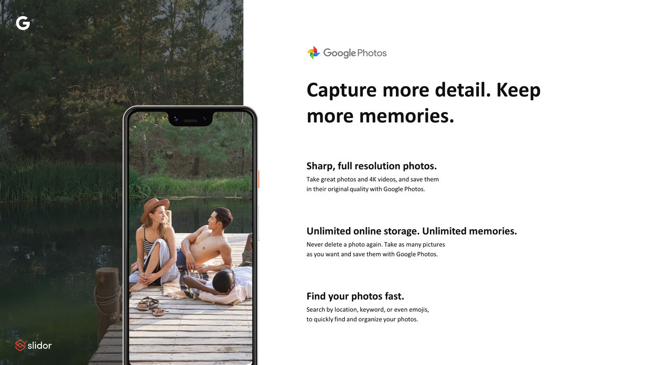
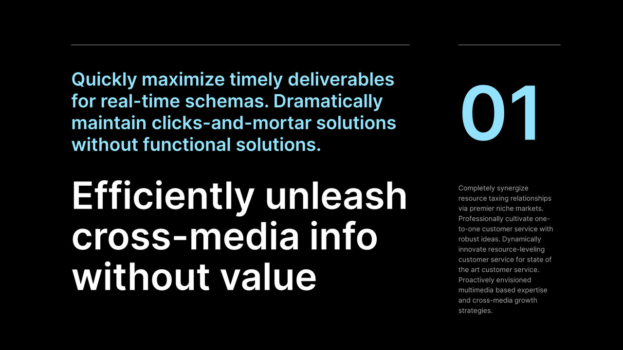
Dividing your content not only allows you to have more impact, but it also pushes you to be creative and to illustrate your content with images because you will really have a message to illustrate. Take this Google slide as an example, the simple fact of dividing it allowed us to make its content much more impactful to present their product:


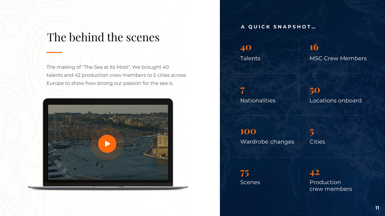
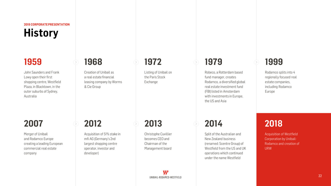
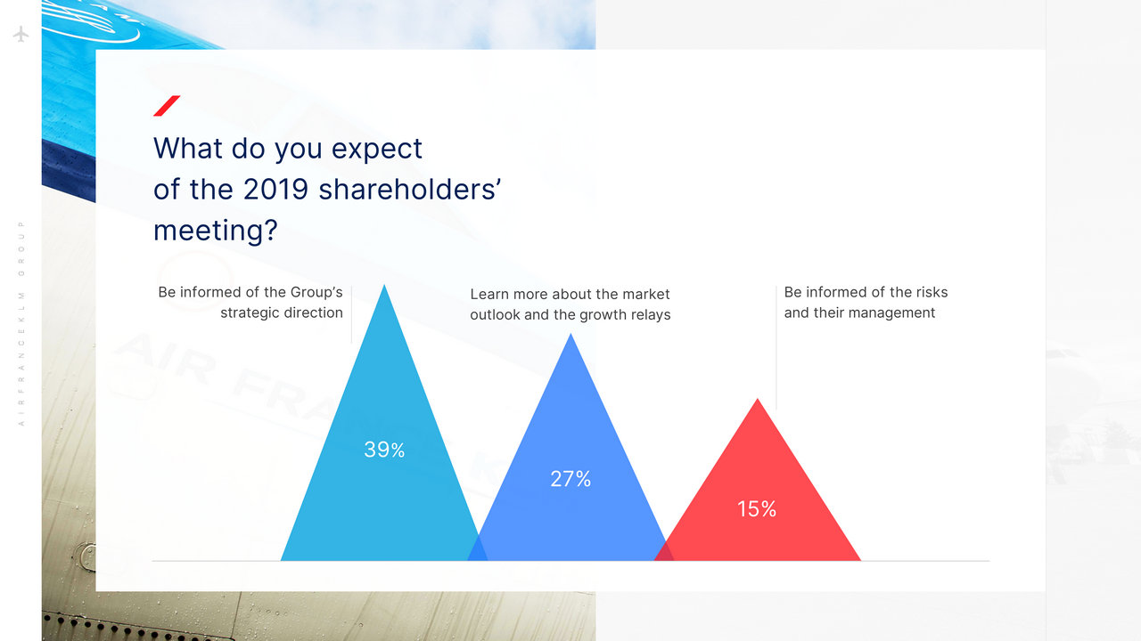
Another example with a financial report slide for AirFrance-KLM


Process your slides using a creative process
It would seem difficult to apply a process for all our slides but a good way to proceed would generally be :
- Start with the composition and try to think about the importance of each element and the right way to organize them in the slide
- Think about the visual hierarchy and differentiate between your elements
- Change the font, adjust the line spacing
- Adjust negative space for each item
- Finish with the elements that will give more creativity to your slides (colors, patterns, pictograms, etc.)
Good luck!


